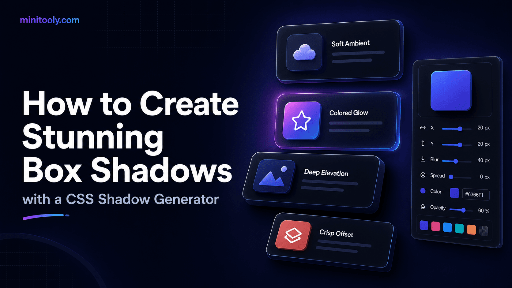
Understanding CSS Box Shadows
In modern web design, subtle depth separates flat, uninspired interfaces from polished, tactile user experiences. The box-shadow property is the primary tool front-end developers use to elevate cards, buttons, dropdowns, and navigation bars. However, writing these declarations manually often involves an endless cycle of trial and error: adjusting pixel values, saving the file, refreshing the browser, and repeating until the effect looks right.
The Anatomy of a Shadow Property
A standard CSS box shadow declaration consists of several key values:
- Horizontal Offset (
x-offset): Moves the shadow left or right. - Vertical Offset (
y-offset): Moves the shadow up or down. - Blur Radius: Determines how sharp or soft the shadow edge appears. Larger values create a smoky, diffused look.
- Spread Radius: Expands or contracts the shadow size relative to the element.
- Color: Defines the shadow hue, often using
rgba()to introduce transparency for natural blending. - Inset (Optional): Changes the shadow from falling outside the box to rendering inside, creating a sunken or pressed-in appearance.
Why Use a Visual CSS Shadow Generator?
While understanding syntax is vital, visualizing abstract numbers is difficult. A specialized CSS shadow generator provides an interactive canvas where you can slide parameters and immediately view how light interacts with UI layers. Instead of guessing how a 15px blur radius looks against a dark background, you instantly see the result and copy the production-ready snippet.
Step-by-Step Guide to Crafting Modern UI Shadows
1. Setting Up the Base Element
Start by defining a clean container, such as a white card on a light gray background. Ensure your element has smooth border-radius properties to keep the shadow contours organic and natural.
2. Adjusting Offsets and Blur
For a natural drop shadow that mimics overhead lighting, keep the horizontal offset near zero, set a positive vertical offset (e.g., 8px), and use a generous blur radius (e.g., 24px) paired with a low opacity black color (rgba(0, 0, 0, 0.08)).
3. Layering Multiple Shadows for Realistic Depth
Real-world shadows are rarely single-layered. High-end design systems often combine a soft ambient shadow with a sharper direct shadow. Using multiple comma-separated shadow values creates a richer, multidimensional look that feels tactile and professional.
Advanced Techniques: Glows and Neumorphism
Beyond standard drop shadows, you can use shadow tools to engineer glowing neon accents or soft UI (neumorphism) effects. By shifting the shadow color to match a vibrant brand palette or using dual highlights and lowlights, your interfaces gain futuristic depth without heavy graphic assets.
Streamline Your Workflow with MiniTooly
When building complex user interfaces, speed and precision matter. Instead of hand-coding multi-layered values, you can instantly design, test, and export your styling rules using the interactive CSS shadow generator. It gives you instant code snippets, custom color controls, and slider adjustments to elevate your components within seconds.
Privacy and Performance Considerations
Generating CSS snippets directly in your browser is completely secure. Because generation happens client-side, your custom design parameters remain private. From a performance standpoint, CSS shadows are rendered efficiently by modern browser graphics engines, though excessive heavy multi-layered shadows on hundreds of animated elements can impact frame rates on lower-end mobile devices. Use them purposefully.
Conclusion
Mastering depth transforms standard layouts into engaging digital experiences. By combining a solid grasp of offsets, blur, and layering with the efficiency of a visual tool, you can produce consistent, gorgeous components for any project.